Native App Iconography
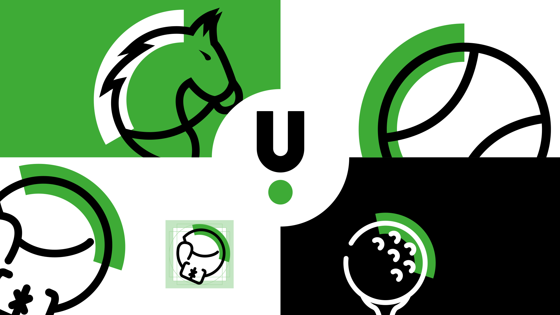
Objective
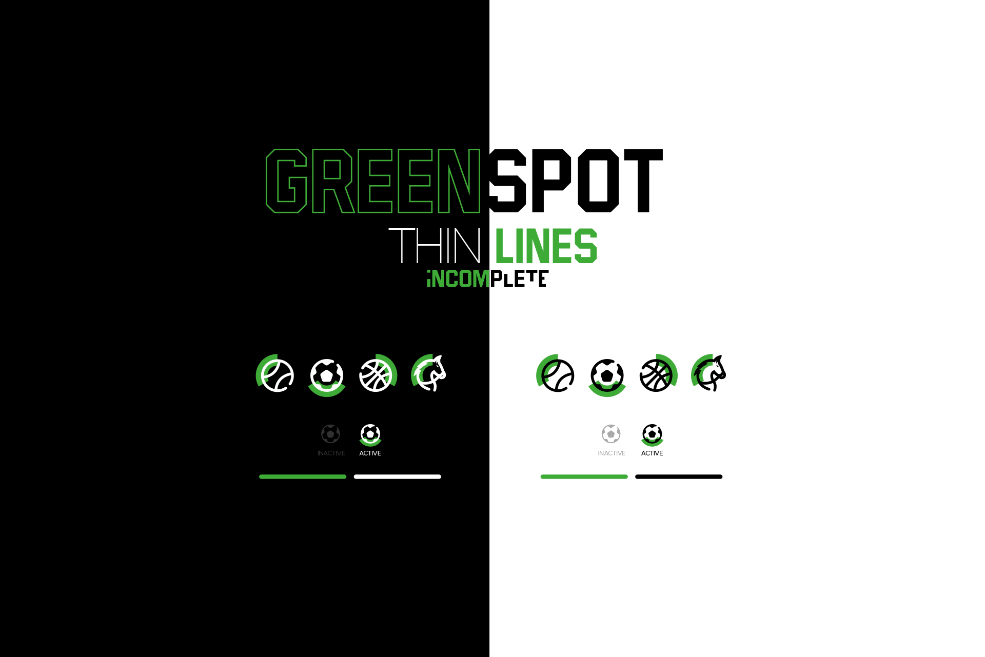
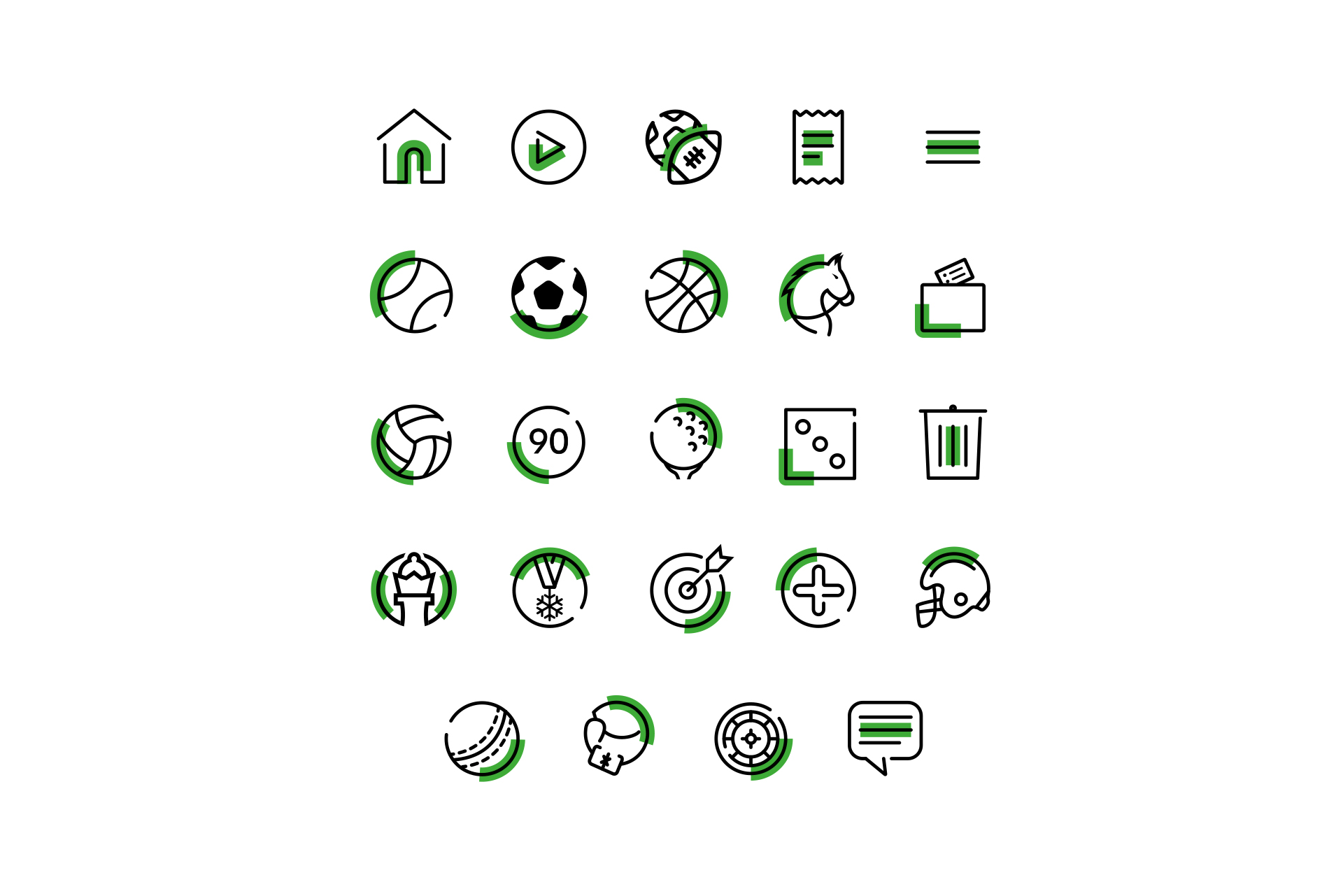
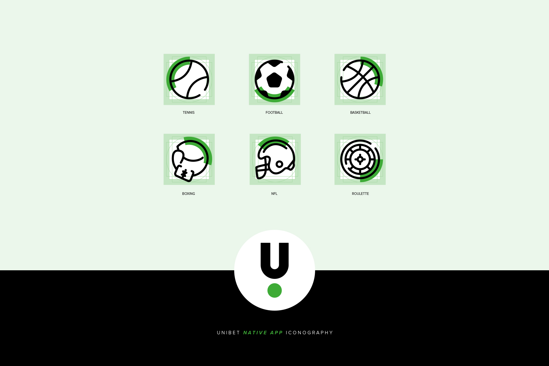
When Unibet set its sights on launching a native app, I took on giving our icons a fresh, modern twist. The challenge was not just about making them look good but ensuring they stayed readable at all sizes and worked with the right colours against our brand palette. The goal was to stand out from the gaming site crowd while keeping a consistent feel.
Solution
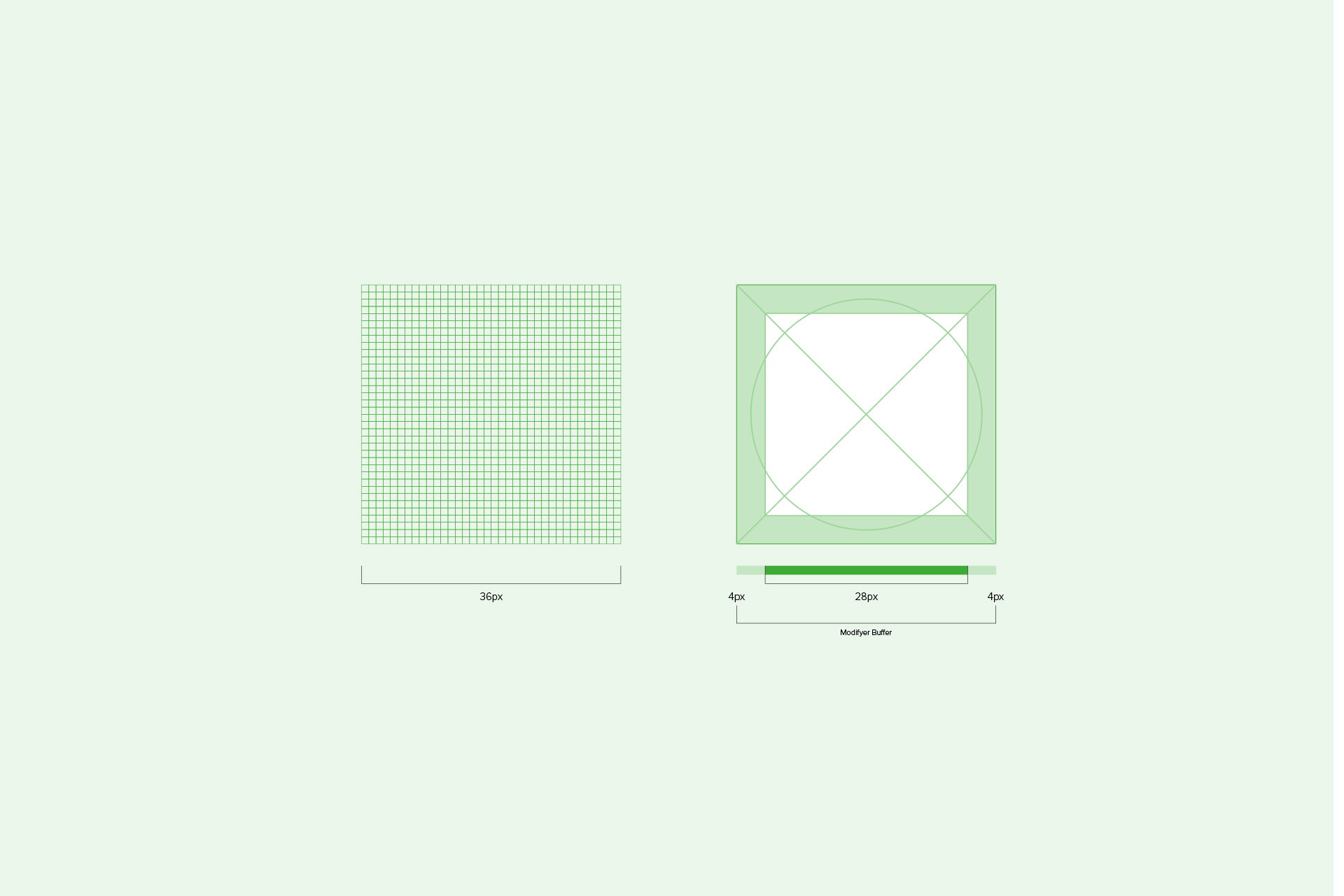
To make sure every icon had that special touch, I started by creating guides and grids for a smooth production journey. No generic icons: I crafted each one from scratch. The result was a set of icons that not only worked in the native app but also found a new home on the Unibet website, earning their place across all platforms.
My responsibilities
- Designing each icon from scratch
- Brainstorming sessions to give them a unique personality
- Handcrafting illustrations
- Quality control for a consistent look
- Research to make informed design choices
- Showcasing design concepts to stakeholders
- Setting the guidelines for a visual roadmap
- Overseeing additional icon production for seamless integration
See the full archive
View all projects